RMRK is retiring.
Registration is disabled. The site will remain online, but eventually become a read-only archive. More information.

RMRK.net has nothing to do with Blockchains, Cryptocurrency or NFTs. We have been around since the early 2000s, but there is a new group using the RMRK name that deals with those things. We have nothing to do with them.
NFTs are a scam, and if somebody is trying to persuade you to buy or invest in crypto/blockchain/NFT content, please turn them down and save your money. See this video for more information.
Church Interior Tutorial

0 Members and 1 Guest are viewing this topic.

*
Communication begins with understanding
Rep:
Level 89
Project of the Month winner for October 2007
Back again with a new tutorial^^. This is the first one in at least 2 months, so I'm happy that I have started again.

Church Interior

Map Size: 23X19

Step A Nun Mansion.

First of all, begin with the walls. The church tileset is interesting, since it has a different type of wall.


With this wall, you can map the rooms like you can't do with other mapping types.

See how close I can put the rooms near eachother.


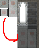
That's because I can have the wall on the first layer. It will now be easier to put out things. The windows can also be on the first layer, since there's not white layer bugging you.
Time to put out carpets and windows.

As you can see, I'm only able to have one window. If I put it somewhere else on the map, it will not look natural, because who's stupid to put a window in the middle of the room?

Use the lighter part of the floor, to make it look like the sun is shining inside.


Now, it's time to put out some furniture's. Put these out on the second layer.


And put paintings, shelfs and other kind of stuff on the third.


Obs! Pointing out!
If you have the edges of the tables on the third layer, you can put chairs under the edges.


Other from that, always have tables on the second layer. Then, you can put things on the tables with the third layer.

Time to put out some nuns!


Advice: If you don't want to get any critism for using to many of the same characters, I give you the advice to open the nun character in either Paint, GIMP or photoshop, and recolour it, and save at a new file. It's not realistic if 10 persons looks like eachother ;D

Step B: Chamber

Map Size: 21X15

OK, start with the walls. Remember, first layer.


Put out the windows and the light effects. Remember, first layer.


And the carpet


And since it's a chamber, put the benches after eachother. Then, it will look like a real church :). After you have done that, put out the big thing in front of them, and after that, the piano( Okay, isn't a piano ;)) but...remember...make the map, so it fits in :(. As you can see, I have nowhere t put it out.


Time to put the rest out. Plants, paintings, nuns and one old priest in the middle, and some villagers praying to their god.


And it's done. Make sure to make things random. The villagers needs to be random! It just look wrong if two people are standing near eachother, and they look the same. <_<

I hope this will help you with the mapping.

~Zhuge Liang/Black Shadow
« Last Edit: October 29, 2007, 07:34:43 PM by Zhuge Liang »

***
Banned
Rep:
Level 91
I AM A MASSIVE FAGGOT
There's a mapping error in the first screenshot~

Edit: Also, you're taking the principal of mapping natural things, and applying it to man made structures. Nature is chaotic, Man made is usually symmetrical, a church would always be symmetrical.
« Last Edit: October 29, 2007, 10:53:51 PM by knobhonker »

*
Communication begins with understanding
Rep:
Level 89
Project of the Month winner for October 2007
Quote
a church would always be symmetrical.

Not always.

And also, ignore the mapping errors. I just want to point out how to map.

**
Rep:
Level 86
Now that its over this weight is off my shoulder
Quote
a church would always be symmetrical.

Not always.

And also, ignore the mapping errors. I just want to point out how to map.

Isn't correctness the point of showing people how to map.  Your interiors look too cluttered.
Now that it's over I love you more and more.

******
Revolution is not a bed of roses.
Rep:
Level 91
Project of the Month winner for July 2009
I beg to differ, they're fine, it doesn't make sense to put space in and not take advantage of it.

**
Rep:
Level 87
RIP w-hat the fork
I thought the tut was fine, but I have one question, why did you put the window on the second layer?
I mean, arn't windows that take up the entire tilespace supposed to be on the first to show off your panaroma?
Huge sig is huuuuge.

******
Revolution is not a bed of roses.
Rep:
Level 91
Project of the Month winner for July 2009
It's probably just a habit, nearly every tileset requires a window on the second layer :P

*
A Random Custom Title
Rep:
Level 96
wah
Not only a habit but it might also be the way his thought processes so when it comes time to fix mapping errors such as that, he knows what layer to look for.

*
Communication begins with understanding
Rep:
Level 89
Project of the Month winner for October 2007
I thought the tut was fine, but I have one question, why did you put the window on the second layer?
I mean, arn't windows that take up the entire tilespace supposed to be on the first to show off your panaroma?

No. Having a window on the first layor only makes mapping errors.

*
A Random Custom Title
Rep:
Level 96
wah
Not really because the window tiles have a wall background on them.

**
Rep:
Level 86
It seems pretty basic to me. Not that it's bad or anything. And the only thing I can complain about is the floor. The tiles and the rags look like you are watching it from above, while the walls indicate that you are watching from a different angle. It's never good if more than 2 perspectives are used AT ONCE.
That's my sole opinion tho. And I say you did a fine job with filling the rooms with objects.

*
Communication begins with understanding
Rep:
Level 89
Project of the Month winner for October 2007
Not really because the window tiles have a wall background on them.

I meant windows in general, since all windows dosen't have a wall backround.

*
A Random Custom Title
Rep:
Level 96
wah
Oh, :P I thought it came with a wall background because the tutorial made it look that way, lol.

*
Communication begins with understanding
Rep:
Level 89
Project of the Month winner for October 2007
Well, that type tileset has a window with a wall backround, so I understand what you mean :)