RMRK is retiring.
Registration is disabled. The site will remain online, but eventually become a read-only archive. More information.

RMRK.net has nothing to do with Blockchains, Cryptocurrency or NFTs. We have been around since the early 2000s, but there is a new group using the RMRK name that deals with those things. We have nothing to do with them.
NFTs are a scam, and if somebody is trying to persuade you to buy or invest in crypto/blockchain/NFT content, please turn them down and save your money. See this video for more information.
Mapping Modern Cities VXA

0 Members and 1 Guest are viewing this topic.

*
RMRK's dad-in-training
Rep:
Level 72
Busy Husband, Dad, and Youth Minister
GIAW 14: 2nd Place (Easy Mode)2014 Best WriterBronze - GIAW 11 (Normal)Secret Santa 2013 ParticipantFor taking arms in the name of your breakfast.2012 Best NewbieContestant - GIAW 9
For my GIAW in a week entry I tried to make a modern/sci-fi game. 

One problem: I'm not happy with the city.  It just looks too big, too much space, not enough life. 

Now that the entries are submitted, I'm trying to improve the look.  Here's my original effort:


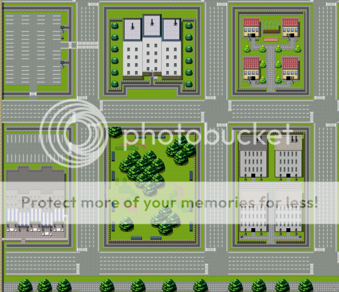
I was going for large apartment buildings, a shop area, and a park.

Should I split this into multiple maps?  One for each area?  Should I use a horizontal feel and use a background?

Made this messing around:


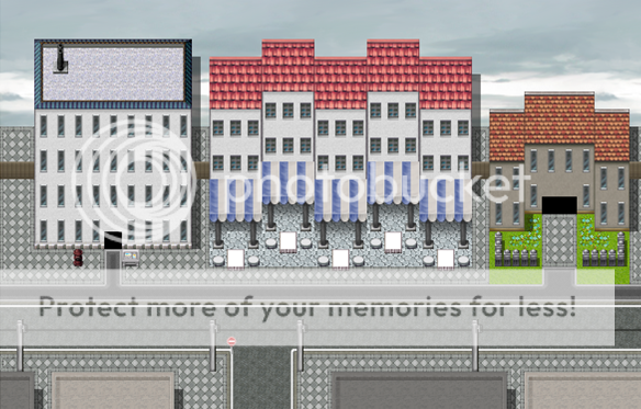
Any better? Does any know of a game I could check out for VX/VX Ace that's modern so I can get some ideas?

Thanks for the tips!

Tilesets I used:
Spoiler for:


« Last Edit: April 03, 2012, 03:07:24 PM by bluntsword »

****
Rep:
Level 63
オ・マイ・ゴッド ・㉨・
The last one, the one made with messing around, is alot better.
It looks nicer, more sleek, and it has more life if people were to walk on the sidewalks  ;8
なんでやねん

***
Rep:
Level 60
Eden: I agree completely, that "messing around" map looks tons better than the original effort, mostly (in my opinion) because of the added sense of depth. So yes, I would recommend splitting the map into multiple areas to enhance that. I'd also just like to add that oh my God that Mack-style tree in your tileset is pixelated as all Hell. I'm sure you can find something comparable that's a little bit less jarringly blocky. ;)

*
RMRK's dad-in-training
Rep:
Level 72
Busy Husband, Dad, and Youth Minister
GIAW 14: 2nd Place (Easy Mode)2014 Best WriterBronze - GIAW 11 (Normal)Secret Santa 2013 ParticipantFor taking arms in the name of your breakfast.2012 Best NewbieContestant - GIAW 9
Eden: I agree completely, that "messing around" map looks tons better than the original effort, mostly (in my opinion) because of the added sense of depth. So yes, I would recommend splitting the map into multiple areas to enhance that. I'd also just like to add that oh my God that Mack-style tree in your tileset is pixelated as all Hell. I'm sure you can find something comparable that's a little bit less jarringly blocky. ;)

lol

I'll do that ;)

**
Rep: +0/-0Level 56
RMRK Junior
I agree with Eden. If you make the map too big or spacious. It will make the map boring and most of people prefer small map with great scenery than big map with a lot of space. Thats what I thought  :-\
My Current Project with Keira Entertainment

***
Rep:
Level 87
Embrace the stillness of eternity.
Not sure if you noticed, but your buildings are casting shadows on the sky. :)

*
*crack*
Rep:
Level 64
2012 Most Unsung Member2012 Best NewbieFor frequently finding and reporting spam and spam bots
Not sure if you noticed, but your buildings are casting shadows on the sky. :)
Cannot Unsee... ;_;
All of my scripts are totally free to use for commercial use. You don't need to ask me for permission. I'm too lazy to update every single script post I ever made with this addendum. So ignore whatever "rule" I posted there. :)

All scripts can be found at: https://pastebin.com/u/diamondandplatinum3

*
RMRK's dad-in-training
Rep:
Level 72
Busy Husband, Dad, and Youth Minister
GIAW 14: 2nd Place (Easy Mode)2014 Best WriterBronze - GIAW 11 (Normal)Secret Santa 2013 ParticipantFor taking arms in the name of your breakfast.2012 Best NewbieContestant - GIAW 9


Five maps shopped together.  Improvement?

Edit - shadows and sidewalk fixed
« Last Edit: April 08, 2012, 02:39:41 AM by Ronald »

*
*crack*
Rep:
Level 64
2012 Most Unsung Member2012 Best NewbieFor frequently finding and reporting spam and spam bots
You've still got shadows in the sky man. ;_;

But yes, that looks very nice. :)
All of my scripts are totally free to use for commercial use. You don't need to ask me for permission. I'm too lazy to update every single script post I ever made with this addendum. So ignore whatever "rule" I posted there. :)

All scripts can be found at: https://pastebin.com/u/diamondandplatinum3

*
RMRK's dad-in-training
Rep:
Level 72
Busy Husband, Dad, and Youth Minister
GIAW 14: 2nd Place (Easy Mode)2014 Best WriterBronze - GIAW 11 (Normal)Secret Santa 2013 ParticipantFor taking arms in the name of your breakfast.2012 Best NewbieContestant - GIAW 9


i fixed it

*
*crack*
Rep:
Level 64
2012 Most Unsung Member2012 Best NewbieFor frequently finding and reporting spam and spam bots
All of my scripts are totally free to use for commercial use. You don't need to ask me for permission. I'm too lazy to update every single script post I ever made with this addendum. So ignore whatever "rule" I posted there. :)

All scripts can be found at: https://pastebin.com/u/diamondandplatinum3