DISCLAIMER: I do NOT take credit for making this tut. It was made by Marcus.READERS NOTE:This guide assumes that you know the basics of mapping; how to select a tileset, make new maps, copy and paste, the three layers, etc. I'm trying to make this as simple as possible without actually holding your hand.
Mapping Tutorial: 001 PlainsIntroductionPlains are large, open grassy fields with little elevation. Temperate plains contain trees and fauna, desert plains are bare, and frosty planes contain few trees and a lot of snow. However, whenever you map for a 2D game, keep this tip in mind:
Tip 1:-Keep maps small and tight. Think of each square as 5'x5'. That means the standard size map (20x15) is actually 100'x75'. That's about a 1/3 of a football field which is constantly visible on screen. Your little man is seeing a lot. This isn't 3D which is scaled; 2D maps MUST be kept small because they simply don't look good spaced apart.

This is what a
real plain looks like however ingame it's incredibly stale and boring. So what can we do to spice it up? Well, that's why I'm taking the time to write this.
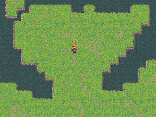
Making Plains 1: Natural EffectsThe first step to making a plains is to get a rough image in your head on it's natural aesthetics. Basically, who lives here and what goes on. There are two very important things to consider in this step; bodies of water and pathways.
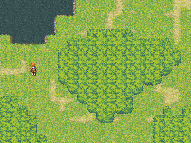
Bodies of WaterWater makes up approx. 70% of our earth and our bodies; it's key to survival and it's key to physical beauty in your maps. I want my map to be cut off by a stream so I'll add that.
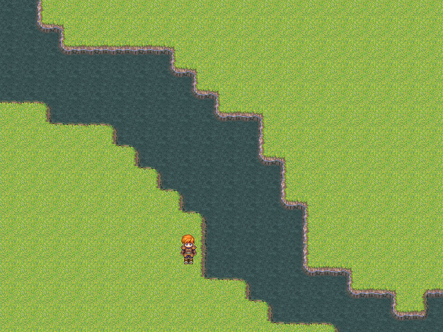
Notice what I did here; the stream is NOT straight. This leads to Tip 2;
TIP 2: Nature is chaotic-Nature has no structure in it's growth; it is wild and free. Erosion degrades soil, water flows regardless of what's blocking it's path (and it stops if it can't move around an obstruction), and there are set designs to a natural landscape. Never, EVER make a natural object like water have a set design or symmetry because it DOES NOT WORK. Water, especially streams, lakes, and rivers, should be as wild as you can possibly make them without going totally out of control.
Okay, on to the next step; pathways.
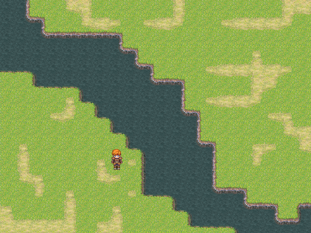
PathwaysPeople other than the hero live in your game (atleast that's the case with most games) and to create this illusion, we make dirt pathways. You see, animals, humans, and even weather corrode the ground and kill grass. This leaves patches of soil left on the ground. However, keep in mind that other factors kill grass as well; maybe the soil just isn't suited for growth. Remember, follow Tip #2 for this rule step as well.
Next, we move on to Floral and Fauna.
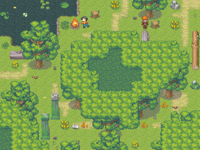
Floral and Fauna:As I said earlier, nature is wild and unpredictable and spawns floral and fauna (you know, trees, flowers, and bushes) via seeds and the natural process of life. To add more rich detail to your maps, there should be some form of life viewable. I'll put these in two categories; trees and static plants.
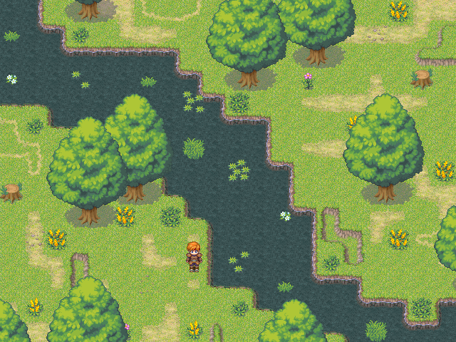
Plants:Plants are simple; place them wherever you like and in random patterns. Keep in mind that wild flowers often grow next to dirt paths (as they collect the most water and sunlight), fungus grows next to trees, and lilypads and smaller flowers grow closer to water if not on it. Sometimes, stumps exist because a tree fell in a lightning storm or someone cut it down. Add stumps if you wish but vary them; an area with a lot of people will have a lot more stumps and visa versa. Rocks and rubble should be placed closer to paths because when animals or people walk, they naturally kick small objects together into piles. Depressions and raised terrain should also be sprinkled around to show the effects of erosion and soil packing. Also, your autotile contains "Dark Grass." While this intended for use as a shadow effect, it can easily be used to simulate the effect of darker/deeper grass colors.

This is looking pretty neat already.
Trees:Trees are important realistically and aesthetically. Trees convert carbon dioxide to oxygen and they look beautiful. When placing trees, stick them anyplace you want but keep in mind that large trees are often spaced out and small trees are closer together. Also, there is usually a larger contingency of trees in areas with a lot of water because it's easier for them to grow there. Please keep in mind these two handy tips when placing trees:
Tip 3: Use the third layer-The third layer is incredibly helpful because it overrides all other layers. When you have a map THIS cluttered, you'll need it as your floral and fauna should almost always be placed on the second layer. However, keep in mind that you have a "fourth" layer available as well in the form of events (click ALWAYS ON TOP when making an event for a "fourth" layer).
Tip 4: More than meets the eye Illusion-Place the tips, edges, and stumps of trees off screen in some areas. Why, you ask? Because this gives the illusion that there is more to your map than meets the eye. Even though the map doesn't extend that far, the player's mind "thinks" that the map is more than a simple 20x15 enclosed room.
Wow, it looks friggin sweet. One last thing left to do.
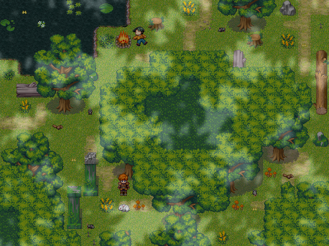
That final breath of life:You WANT to create the illusion that people live in your world so how do you do that? By adding little things that "breathe" life in your game.
Bridges:People don't like to get their feet wet, so we create a bridge. We do this using the 2nd and the third layer. The 2nd layer acts as the bridges "base" and the 3rd layer acts as the lower railing. This role is reversed but still applied when making a verticle bridge. Here, you'll be seeing a horizontal bridge put to work. If you decide to build the bridge using the 1st layer, remember the shift button trick when placing wooden planks on the 1st layer.
Tip 5: Hold down shift-When you hold down shift, you directly "paint" the selected tile over the previous tile. This allows you to bypass the headache of "overwriting" the previous tile which causes problems with auto-tiles to erase and correct themselves. Unfortunately, I can't explain it better than this, but you'll understand it with practice.
Tents and CampfiresCamping is fun, but in a fantasy game it's often the only means of resting outside of an inn or tavern. Logically, a tent should be placed in a nice, shady area. A campfire is placed in front of the tent and there should be logs available and a nearby source of water in order to douse the fire and to drink. I

Wow, this looks better than I expected. Finally:
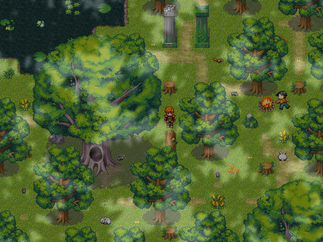
Using events:Events add that final breathe of life to your map that makes it truly come alive. I won't tell you how to use events on your map, but keep in mind that plains attract insects, small mammals, and the occasional camper by his tent. Don't put too many events, though, because then your map will look redundant and it will lose that special "flare." Also, fog effects like clouds and fog can add an extra touch to your map but use them SPARRINGLY. Overlays can easily ruin a map just like they can add to it.
THE FINAL PRODUCT:
Isn't that gorgeous? It's pleasing to the eye as well as practical and useful. This is true quality work.
CONCLUSIONGuess how long it took me? EXACTLY 55 minutes
COUNTING the time it took me to type up this tutorial, organize it, take and upload the images. It would have probably taken me 5-10 minutes if I wasn't typing.
You see, good maps set a game apart. While story and gameplay are what make rpg's unique, you MUST have pleasing visuals or else people will have less of an inclination to download and try your game. If you knew NOTHING about 2 different projects, would you play the project that looked like this:

over this:
I mean, the first image is SERSIOUSLY what some maps I've seen look like.
Please, think of your maps. Take these steps in head when making a plains map and you will create something that's visually stunning and people will be more likely to download your game. It's not hard to make good maps given the RTP and it's severe limitations; you just have to try. Remember these steps and the steps in the next tutorial and PRACTICE PRACTICE PRACTICE. You will NOT get good immediately. You MUST practice or else you'll continue to fail (and you must learn from these failures as well).
_____________________________________________________
This time we'll focus on the rtp tileset 002 Sunny Forest. It's a rather difficult and limited map to use, mainly because of the awful "canopy" tile, but I'll help you through it so you can learn the ins and outs and create a nice looking forest.
Things you need to know:This (and quite possibly ALL) tutorial will assume that you read the Plains tutorial as I will make several references to it. The plains tutorial will serve as the basis for all the other tutorials simply because I don't want to recopy too much information.
Mapping Tutorial: 002 Sunny ForestIntroductionForests are areas that contain a vast amount of trees and underbrush in a rather confined space. Little light sheds through the canopy which creates a darker tone and atmosphere (despite being... sunny).
I'll go through the basic steps we went through during the Plains tutorial.

First, we start with a blank map.
Next, we add our water and our paths.
From here, we have two disctinct styles and choices for our map (or we could combine the two). One involves using the "canopy" tile and the other involves using the normal trees provided. I'll first guide you through the canopy use.
Using the CanopyWhat is the canopy tile? It's a tile that's supposed to "simulate" the canopy of leaves and branches you see when pearing down on a thick patch of trees. Honestly, I hate the canopy and newbies to map making SHOULD NOT use it without practice. Fortunately, I'm here to help ease your way into practice.
Canopy Tip:-DO NOT use the canopy unless you want to simulate a large section of trees. I've seen maps that have a thin strip of the canopy tile with trees underneath. You're using the canopy because you DON'T want to add extra trees.
When using the canopy, set it to the 3rd layer because you must place trees underneath it in the 2nd layer. Remember that nature is crazy and has no regard for symmetry.
Next, we add trees underneath it in the 2nd layer. When doing this, KEEP IN MIND the gap in shadows. You must fill that gap in otherwise the illusion that the trees are a part of the canopy is ruined.

As you can see, using the canopy is very difficult and you MUST be careful of the canopy's shape. Unfortunately for me, I choose a pretty oblong shape which destroyed the look. This leads me to the next tip...
Tip 6:-If you can't get something to look the way you want it, cover it up. As you can see, I added an extra addition to the canopy to make up for the fact that it just doesn't look very good. Please, don't make a habit out of this. It's only good if you have NO alternatives.
Now, we finish off our map as we did during the plains tutorial.

Add the floral and fauna as well as minor details.
Add in your events. Keep in mind that because there are more places to hide, smaller animals should be more abundant in forests.
Tint:Finally, let's go over tint. Because forests leave little room for the sun to peak through, it's advised that you tint your maps to add more of a "foresty" feel.
There we go. Notice how I tinted the screen and changed the overlay to match the area. It doesn't please me that much, but it'll do for now. You can always tweak your tint settings and change the overlay. It is your map afterall.
Forest: Normal VersionLet's go over how to make a simple forest without using the canopies. First we add the minor details.

See, we can add more things because there are less trees.
Speaking of trees, it's best to toss those in.

It goes without saying that forests have a heavy population of... you know, trees.
And here it is, the final product.
ConclusionThe sunny forest tileset is pretty difficult to use by beginners because of the odd canopy tile. Hopefully, with this tutorial, you'll be one step wiser to pull off a really spectacular map.
_____________________________________________________
This time we'll focus on the rtp tileset 003 Dark Forest.
Things you need to know:This tutorial will assume that you read the Plains tutorial and I will also be referring to the Sunny Forest tutorial.
Mapping Tutorial: 003 Dark ForestIntroductionThe dark forest is the exact same as the sunny forest except for a few minor alterations.
Because of the similarities, I'll be focusing on a different style for the Dark Forest than actually making a forest. I'll be making a SPOOKY GRAVEYARD. Follow along if you will.
First, we start out with the basic layout.
Next, I would like to mention something about symmetry. I would like to bring a mild point up. Symmetry is good when dealing with man made structures. You see, symmetry to the human eye is visually pleasing. Unlike nature, we are bound by law and order as is our man-made structures. When making manmade structures, keep in mind that keeping things symmetrical usually results in more refined look.
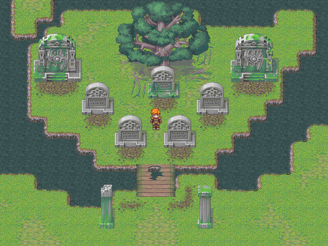
Notice the certain style of placing the tombstones. Also, the single tree helps clue the player in that man planted it for a specific purpose. Because everything is old, it has naturally decayed and moss has taken root. I added the dirt in front of the tombstones to symbolize the fact that the ground will never settle with dead people under it.

We add the little details and touches now.
Making things dark and creepyAlthough I don't stress the importance of overlays, in a dark area they can really bring out the atmosphere. Use thick fog but make sure the player can still see his surroundings with some detail. Tint the area as well but keep in mind that nobody wants to play completely in the dark. For extra atmosphere, add some ghost charactersets but set their opacity really low so they are almost transparant. With some good background sound effects, you can create a really nice atmosphere.
Conclusion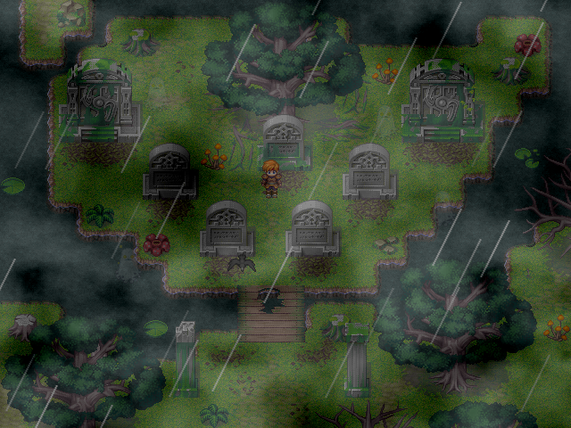
Well, here's the final piece. You can alter the opacity and thickness of your fog but remember not to make it too overpowering. Weather effects and a parallel process event that flashes the screen and simulates thunder is another good way to add to the atmosphere.
_________________________________________________
Mapping Tutorial: 004IntroductionThe mountain and seaside road are difficult to use well because you have to constantly switch between layers to match up proper elevation. Hopefully, this guide will help guide you through the process it takes to make a really sweet mountain. Also, I happened to roll up the Desert, Marsh, and Snow tilesets in here as well as they're both very similar to the previous tilesets.
Mountain RoadFirst, I'm going to start out with mountain road. Because it's hard to make a mountain on such a small mapsize, I'll go with changing the default properties to 30x25.
The first thing we need to do is formulate a plan. You should always have a basic plan in your head. I decided that I'm going to have two hills with a bridge on them spanning a large chasm. First, I'll make the chasm just to get it out of the way. Remember, you'll be using all of the layers in this tutorial as it's important to get the right look.

Here's the basic layout. We do this first because it saves us headaches latter in the editing process. Notice that the random nature rule also applies here.
Natural BeautyMountains are beautiful locations built by the constant "cutting" of internal streams and rivers. I want to simulate this by having a small waterfall on the top of my map. I'll also add the pathways (to show where the hero comes in on the map), some of the autotiles, and a little ramp that let's the hero reach the top of the hill.
Okay, next, I want to talk about bridges. Unlike the Plains map, bridges in Mountains are very picky. You see, you HAVE TO HAVE the exact same elevation of the area you're trying to connect to or else the illusion is ruined. Here's an example of a wrong bridge.
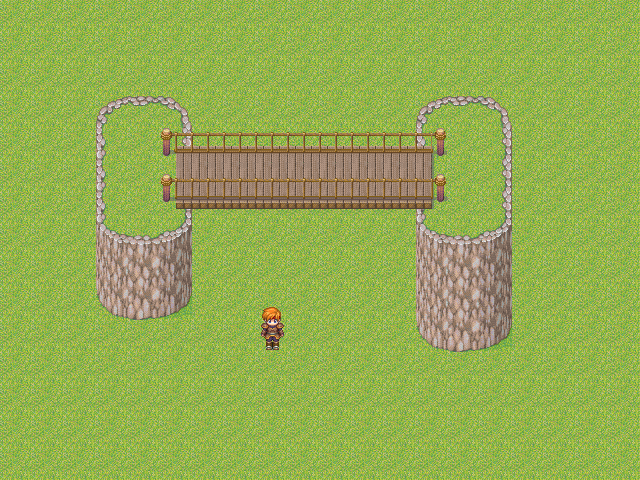
See? This is a BAD bridge. Notice the wacky elevation. Wood bridges cannot extend upwards. The illusion is ruined. Other than that, a bridge in mountain works just like a Plains bridge.
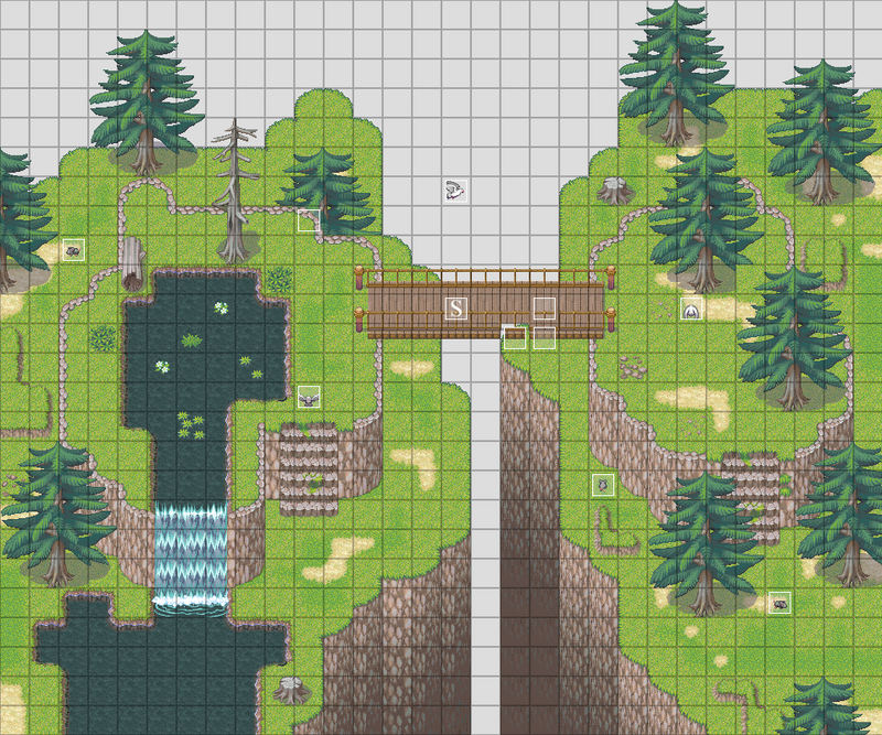
Anyways, here's the final version. Notice how I needed to replace some things with events because they simply won't overlay each other in the map editor. Remember, events act as your 4th layer because they override everything.
 Conclusion
That looks nice, doesn't it? Beautiful view, rickety old bridge, could be a good place to have a villain showdown. Notice in the lower right corner there's a piece missing. That's because I accidentally went over it with the dark grass autotile. I'm going to leave that piece there to prove a point; you should always go over your maps by holding down control (it makes your hero auto-phase) and checking little things like that. The reason the mountain isn't as cluttered as the other maps is because
1: Mountains don't have as much life
2: Mountains don't have much walking space.
The mountain looks bare yet still passably vibrant. Just keep in mind that cluttered mountain maps are really hard to walk through in-game because there's so much more going on.
.

 Light Style